Bluestone
When designing the brand identity for Bluestone,the goal was to create a visual language that balances heritage, modernity,and an unmistakable sense of quality. Every element—typography, colors,packaging, and patterns—was meticulously crafted to ensure that Bluestonestands out in the highly competitive food and hospitality industry.
The Logo: A Statement of Strength& Simplicity
The Bluestone logo is a bold yetrefined wordmark, exuding confidence and timeless appeal.
This combination gives Bluestone alogo that feels both established and forward-thinking, setting the tonefor a premium yet approachable brand.
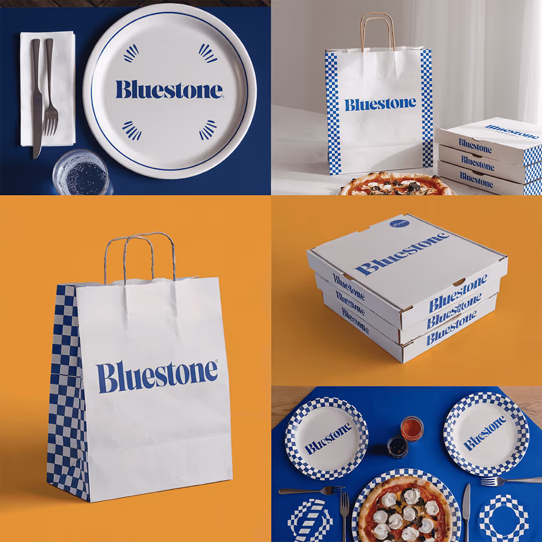
The Color Palette: Inspired byTradition & Freshness
The deep navy blue and crisp whitecolor scheme plays a crucial role in Bluestone’s identity, evoking authenticity,trust, and timeless craftsmanship.
🔹Navy Blue (#003366) – Represents stability, reliability, and tradition, reinforcing the brand’s dedication to quality.
⚪White (#FFFFFF) – Creates a sense of cleanliness, simplicity, and approachability, making the brand feel fresh and inviting.
🔶Accent Color – Warm Orange – Adds a touch of vibrancy, warmth, andenergy, creating a visual contrast that feels contemporary and engaging.
This classic-meets-modern colorcombination ensures that Bluestone is instantly recognizable andvisually striking.
Pattern & Packaging: A Distinct Visual Identity
The checkerboard pattern incorporated into Bluestone’s branding is a signature design element,adding both nostalgia and modern flair.
✔Inspired by Classic Pizzerias & Retro Diners – The checkered designnods to timeless restaurant aesthetics, reinforcing Bluestone’scommitment to authentic, high-quality food experiences.
✔Versatile & Dynamic – Whether used as an accent on pizza boxes,paper bags, plates, or placemats, the pattern creates a cohesive andinstantly recognizable brand identity.
✔Premium Yet Approachable Feel – The clean, structured application ofpatterns and typography ensures that the branding remains sophisticated yetinviting, appealing to both everyday customers and food connoisseurs.
The Experience: A Brand That Feels AsGood As It Looks
The Bluestone brand identity is not just about aesthetics—it’s about crafting an experience that feels premium, nostalgic, and exciting all at once.
💡A strong visual presence that commands attention in-store and online
💡Packaging that enhances the dining experience, making Bluestone instantlyrecognizable
💡A blend of tradition and modern design, ensuring longevity and broad appeal
At 7hink, we believe that great branding is about more than just a logo—it’s about creating an identity that tells a story and leaves a lasting impression. With Bluestone, we’ve built a bold,distinctive brand that feels as premium and authentic as the food it represents.
Related Projects


Powered by AI. Perfected by Humans. Personalised for You.

Head Quartered in Dubai, United Arab Emirates
7hink IT Solutions LLC
East Wing, Latifa Tower - B2007-256 Sheikh Zayed Rd – Trade Centre – Trade Centre 1 – Dubai
Phone: +971 544864221
Mail: hi@7hink.com
Find on Social Media