Revaé Aesthetics
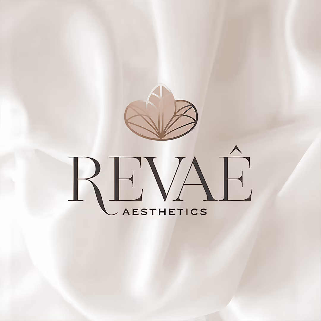
Revaé Aesthetics Logo Design
For a high-end skincare clinic likeRevaé Aesthetics, the brand identity had to capture more than just aesthetics—it needed to embody transformation, confidence, and luxury.The logo was designed to reflect the clinic’s commitment to skinrejuvenation, elegance, and premium care, ensuring that every visual element aligns with the sophisticated experience Revaé offers.
Typography: A Balance of Refinement& Trust
The typography chosen for RevaéAesthetics is a blend of elegance and professionalism, designed to evoke confidence, sophistication, and timeless beauty.
This combination creates a visual identity that resonates with high-end clientele, making Revaé Aesthetics aname that is both memorable and aspirational.
The Emblem: A Symbol of Renewal &Radiance
Above the wordmark sits Revaé’ssignature emblem, a delicate yet impactful mark that reflects the core philosophy of beauty, renewal, and confidence.
The emblem serves as a visual metaphor for transformation, mirroring how Revaé’s treatments help clients rediscovertheir skin’s natural glow and beauty.
A Color Palette That Speaks Luxury& Purity
The Revaé Aesthetics color palette was intentionally curated to create an atmosphere of calm, elegance, andsophistication—essential for a high-end skincare clinic.
✨Deep Charcoal Gray – A symbol of professionalism and authority,reinforcing trust in expert-led skincare treatments.
✨Champagne Gold Gradient – Represents luxury, radiance, and rejuvenation, mirroring the clinic’s premium services.
✨Soft Ivory White – A reflection of purity, minimalism, and refined beauty, ensuring a clean and timeless aesthetic.
This combination ensures that RevaéAesthetics looks and feels like a luxurious, results-driven skincare destination.
The Final Impression: A Logo That Defines Premium Skincare
The Revaé Aesthetics logo is more than just a brand mark—it is an invitation to an exclusive skincare experience. It conveys luxury, confidence, and timeless transformation,making it clear that Revaé is not just a clinic—it’s a destination for those seeking the best in skin rejuvenation.
At 7hink, we craft branding that elevates businesses beyond visuals—into unforgettable experiences. With Revaé, we’ve created a sophisticated and aspirational identity that resonates with clientswho seek excellence in skincare and beauty.
Related Projects


Powered by AI. Perfected by Humans. Personalised for You.

Head Quartered in Dubai, United Arab Emirates
7hink IT Solutions LLC
East Wing, Latifa Tower - B2007-256 Sheikh Zayed Rd – Trade Centre – Trade Centre 1 – Dubai
Phone: +971 544864221
Mail: hi@7hink.com
Find on Social Media