ZOHA Skincare Clinic
ZOHA Skincare Clinic.
The ZOHA Aesthetic Clinic logo and brand identity were meticulously crafted to reflect the essence of luxury, sophistication, and timeless beauty. In the highly competitive skincare and aesthetics industry, first impressions matter. ZOHA needed a visual identity that not only looked premium but also evoked trust, refinement, and expertise.
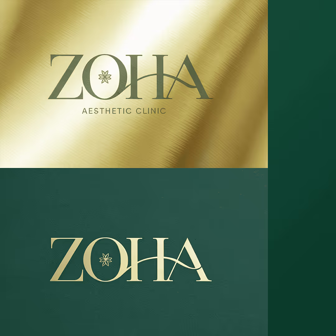
The Logo: A Harmonious Blend ofPrecision & Fluidity
The ZOHA logo is a carefullybalanced composition of elegance and modernity, capturing the brand’scommitment to aesthetic perfection and natural rejuvenation.
✨Refined Serif Typography – The bespoke serif typeface conveys grace,sophistication, and authority. The structured yet flowing letterformsreflect the scientific precision of dermatology combined with the artistryof beauty enhancements.
✨The Signature 'H' Curve – The fluid curve in the letter ‘H’ is a subtle nod to transformation, symmetry, and the journey to refined beauty—a core philosophy of ZOHA’s treatments. This curved element softens the boldness of the typography, adding an organic, graceful touch that feels inviting and luxurious.
✨The Floral Emblem in the ‘O’ – At the heart of the logo lies a delicate botanical-inspired star, seamlessly integrated into the letter ‘O’. This element symbolizes natural beauty, renewal, and the purity of skincare treatments, reinforcing ZOHA’s philosophy of blending nature with medical aesthetics.
A Color Palette That Speaks Luxury& Trust
A well-chosen color palette is keyto brand recognition and emotional connection. For ZOHA, we carefully curated adeep green and gold combination to create an identity that exudes exclusivity,prestige, and rejuvenation.
🌿Deep Forest Green (#214D3F) – Represents growth, renewal, and a deepconnection to nature. Green is often associated with calmness, healing,and trust, making it the perfect foundation for a brand specializing inskin transformation.
✨Radiant Gold (#D4AF37) – A universal symbol of luxury, success, andhigh-end service. The gold accentuates the brand’s premium positioningwhile adding warmth and elegance, reinforcing the idea that ZOHA providesnothing short of the best skincare experience.
The interplay of these colors creates abalance between opulence and natural beauty, ensuring that ZOHA’s brandingis both aspirational and inviting.
A Brand Identity That Feels Exclusive& Timeless
Beyond the logo and colors, everytouchpoint of ZOHA’s branding was designed to maintain a sense of luxury andconsistency across various mediums—whether it’s clinic signage, businesscards, or product packaging.
✔Minimalist yet Impactful Design – The clean layout and subtle textures ensure that ZOHA’s branding is effortlessly elegant and timeless, free from excessive ornamentation.
✔Versatile & Scalable – The logo retains its prestige and clarity across different formats, whether embossed in gold on a product box or displayed digitally.
✔A Seamless Fusion of Science & Beauty – The mix of structured typography and organic curves reflects the clinical expertise behind ZOHA while maintaining a soft, inviting appeal.
The Result: A Brand That Inspires Confidence & Exclusivity
The ZOHA brand identity goes beyond aesthetics—it tells a story of transformation, renewal, and timeless beauty. It sets the stage for an experience where clients don’t just receive treatments; they step into a world of luxury, self-care, and elegance.
At 7hink, we believe that abrand’s identity should be more than just a logo—it should be an experience.With ZOHA, we’ve crafted a visual language that speaks to high-endclientele, ensuring that every interaction with the brand feels premium,sophisticated, and deeply aspirational.
Related Projects


Powered by AI. Perfected by Humans. Personalised for You.

Head Quartered in Dubai, United Arab Emirates
7hink IT Solutions LLC
East Wing, Latifa Tower - B2007-256 Sheikh Zayed Rd – Trade Centre – Trade Centre 1 – Dubai
Phone: +971 544864221
Mail: hi@7hink.com
Find on Social Media